Let’s begin with iOS, whose UI has a flat design style. Its skeuomorphic features from earlier iterations have been removed. Android design relies on shadows to show hierarchy, and its UI resembles layers of paper.
iOS has San Francisco as the system font, while Android uses Roboto.
Ofcourse, elements like UI controls, buttons, icons etc., also vary. iOS uses centre alignment for the title, whereas Android has a left-aligned title.
Look closely, and in iOS, the title is often replaced with the brand logo. In the case of button styles, Android uses uppercased text, and iOS uses title cased text, though this rule can differ.
Both human interface design and material design guidelines define an assortment of button styles. iOS design guidelines dictate buttons that are more flat as compared to Android controls.
Grid Specifications in Android & iOS
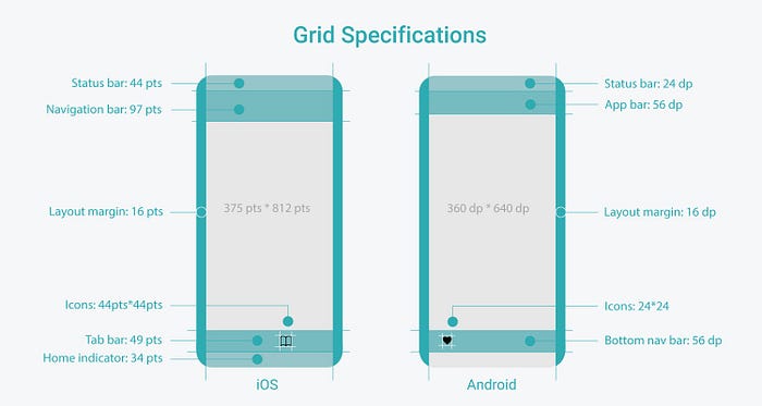
iOS UI is developed in points (pt). Android apps, with their material design guidelines, are developed with what are called density-independent pixels (dp).
The design needs to be within the specified safe area. In UI design, it’s regarded as a good practice to design for narrow screen size first.
According to iOS design guidelines, 375 pt is deemed the right screen size (width) for designing. For Android it is 360 dp.
Height is not a limitation when considering the screen size. The size of the navigation bar/app bar and tab bar/bottom navigation bar also needs to be followed.