Flexbox simplifies web design. It allows you to organize, align, and distribute space among items in a container, even if their sizes are dynamic or unknown. It’s an essential tool that makes creating responsive and cohesive designs easier.
Kickstarting with Flexbox
To harness the power of Flexbox, set an element’s display property to flex.
.container{
  display: flex;
};
And thats it, now you’re able to use flexbox in that element as a container, and in his childrens, as items.
Flexbox Fundamentals
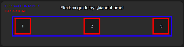
Flexbox is structured around two core components: the flex container and the flex items. In the following example the container is highlighted in color blue and the items in red:
Flexbox Anatomy
Flexbox introduces a paradigm shift in layout thinking. It emphasizes a main axis and a cross axis, moving away from the conventional block and inline flow.