In the ‘Marks.csv’ file, you can find the scores obtained by 200 students in 4 subjects of a standardised test. The different columns — Score A, Score B, Score C and Score D indicate the score obtained by a particular student in the respective subjects A, B, C and D.
Load the dataset to your notebook and answer the following questions
#Load the necessary Libraries

import pandas as pd

import numpy as np

import seaborn as sns

import matplotlib.pyplot as plt
#Load the dataset

df1 = pd.read_csv("Marks.csv")
df1.head()

df1["Score A"].plot.hist(bins=6)
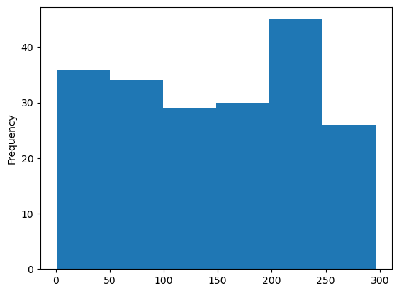
Q1) Load the dataset and plot a histogram for the Score A column by keeping the number of bins to 6. Which bin range among the following has the highest frequency?
(Note - The bin ranges mentioned in the options are approximate values for the bin ranges that you'll actually get when you plot the histogram)