Over the years, I have had many encounters with Japanese websites — be it researching visa requirements, planning trips, or simply ordering something online. And it took me a loooong while to get used to the walls of text, lavish use of bright colors & 10+ different fonts that sites like this one throw in your face:
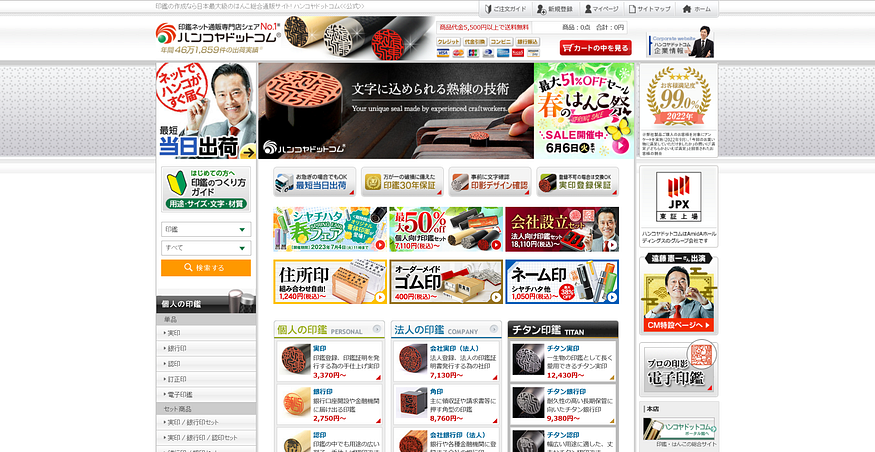
Hankoya — a website for Japanese seals, which are used to sign all kinds of official documents. (https://www.hankoya.com/)
Though there are numerous examples of sites with a more minimalistic and easy to navigate design for someone used to Western websites, it is worth examining why this more convoluted style remains prevalent in Japan.
And just to be clear, these are not remnants from the past, but maintained sites that — in many cases — were last updated in 2023.