Scripbox is a portfolio planning service seeking to redefine wealth management. As the illustrator on the design team at Timeless, my task was to come up with a visual style and create several illustrations within that framework.
Let’s take a look at the basic framework developed to create illustrations in a unified and relatable manner.
About the illustration system
The illustrations needed to be subtle yet detailed in order to complement the UI. Playing with textures and creating a unique perspective within the illustrations helped create a one-of-a-kind simple style that could be used throughout the branding.

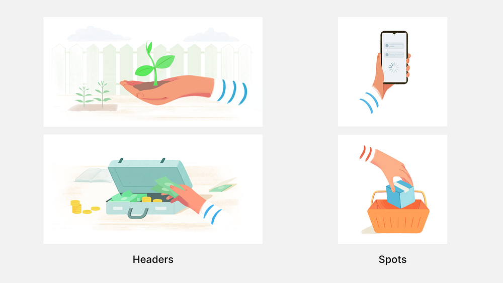
Two types of illustrations are created:
- Headers: These are large scale, complex illustrations created to represent the various investment plans offered. They intend to capture the nature of the investment being offered while also creating a scalable composition that can be re-used throughout the app.
- Spots: These are smaller illustrations created to illustrate CTAs, empty states and more. They are mostly independent subjects without a background.