In my humble opinion, the best websites and web applications have a tangible “real” quality to them. There are lots of factors involved to achieve this quality, but shadows are a critical ingredient.
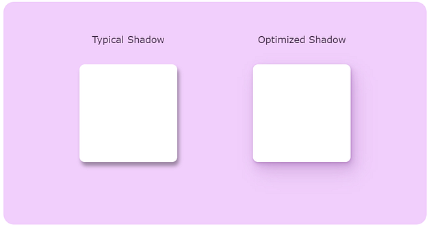
When I look around the web, though, it’s clear that most shadows aren’t as rich as they could be. The web is covered in fuzzy grey boxes that don’t really look much like shadows.
In this tutorial, we’ll learn how to transform typical box-shadows into beautiful, life-like ones:
Intended audience: This tutorial is intended for developers who are comfortable with the basics of CSS. Some knowledge around
box-shadow,hsl()colors, and CSS variables is assumed.
Why even use shadows?
We’ll get to the fun CSS trickery soon, I promise. But first, I wanna take a step back and talk about why shadows exist in CSS, and how we can use them to maximum effect.