The DateRangePicker is a user interface component in Android that allows users to select a range of dates. It is commonly used in applications where a date range selection is required, such as booking systems or event planners.
Add below dependency
implementation "androidx.compose.material3:material3:1.1.0"
Creates a DateRangePickerState for a DateRangePicker that is remembered across compositions. You can pass the below defaults parameters.
val state = rememberDateRangePickerState()
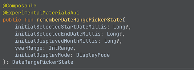
initialSelectedStartDateMillis — timestamp in UTC milliseconds from the epoch that represents an initial selection of a start date. Provide a null to indicate no selection.
initialSelectedEndDateMillis — timestamp in UTC milliseconds from the epoch that represents an initial selection of an end date. Provide a null to indicate no selection.
initialDisplayedMonthMillis — timestamp in UTC milliseconds from the epoch that represents an initial selection of a month to be displayed to the user. By default, in case an initialSelectedStartDateMillis is provided, the initial displayed month would be the month of the selected date. Otherwise, in case null is provided, the displayed month would be the current one.
yearRange — an IntRange that holds the year range that the date picker will be limited to
initialDisplayMode — an initial DisplayMode that this state will hold