blogTO is Toronto’s main stop for local news, reviews, and best of lists. Created in 2004, it’s one of the city’s longest standing culture sites. A new visual identity and responsive web design were required to help the organization preserve its place as a contemporary destination for all things Toronto.


Getting ready
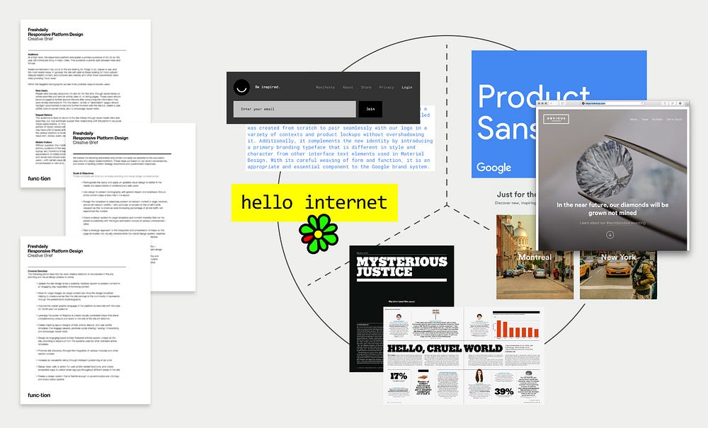
Prior to any new exercise, the design problem needs to be articulated. A creative brief is the first step in clearly understanding the task at hand. Visual mood boards were also used to help with orientation prior to visual identity exploration.